
"Exhibition of Ceramics & Prints" Stanley Thomas Clough. 1938.
This color palette is pretty much complimentary with shades of white and/or black. There is no gradual blending with the shades of black, and this piece has very good constrast. With the different ways of combining objects, the artist draws one in to take a closer look at this piece and to see others.

"Discover Puerto Rico U.S.A. : Where the Americas Meet" Frank S. Nicholson. 1936 - 1940.
This poster has plenty of colors in its palette. Although the colors are washed, it still gives the 3D effect with the almost gradual change from light to dark. It definitely entices one to visit and check their great food and/or wine.
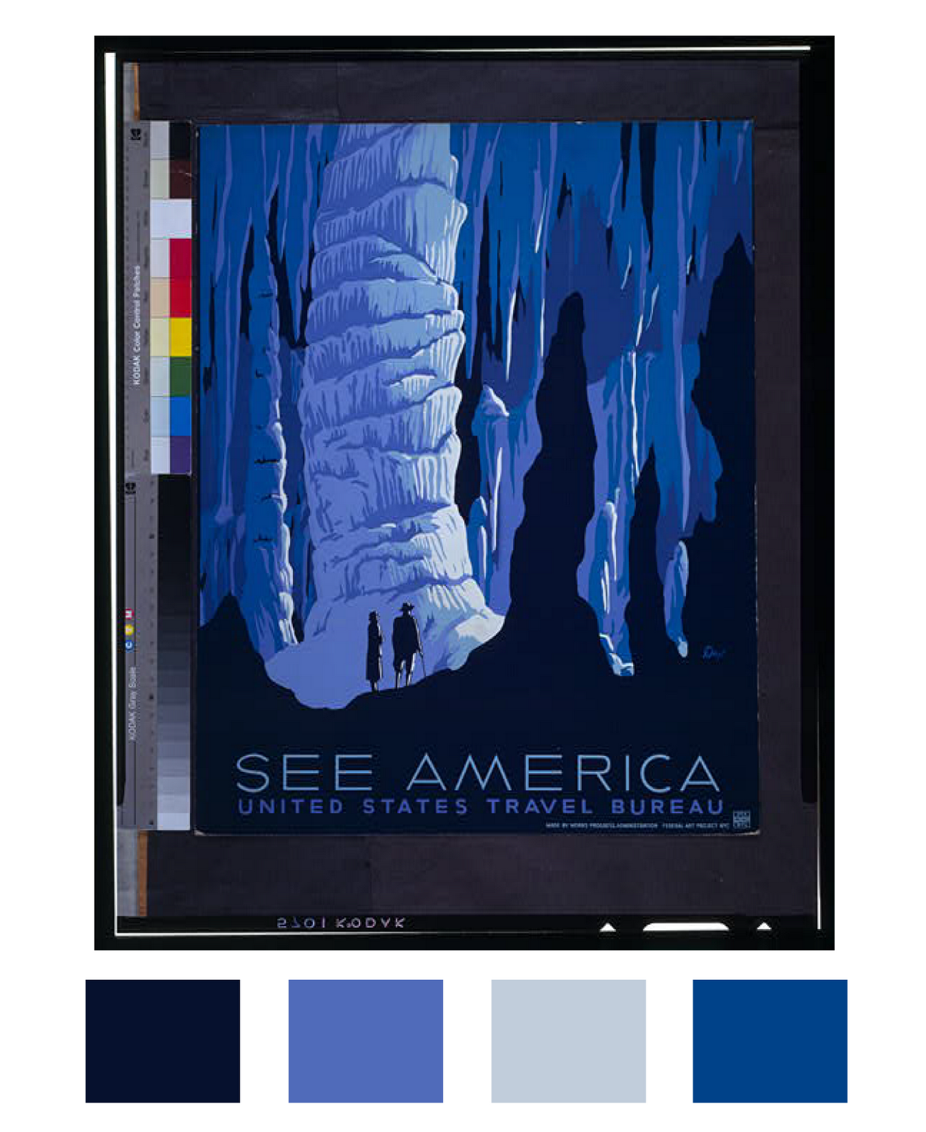
"See America" Alexander Dux. 1936 - 1939.
This piece is blue monocromatic. Even though the shading seems a little more gradual, it also seems like a silhouette. Also at certain glances the foreground becomes the background. So, Go Travel!